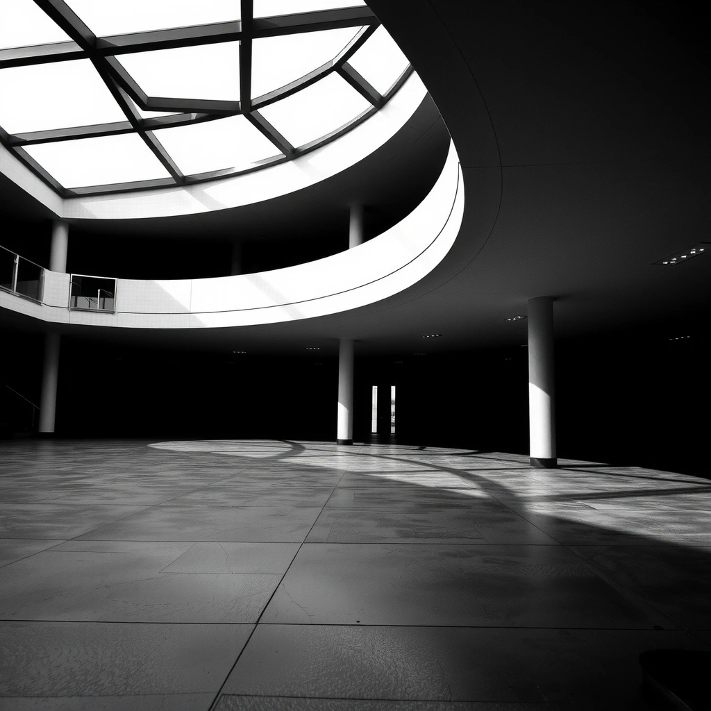
Studio Background
Asenela was founded in 2009 in Dublin with a singular vision: to bridge the gap between analytical precision and digital aesthetics. We began by developing early mobile platforms for data visualization, focusing on creating interfaces that allowed users to process complex information streams instantly.
Over the past decade, our trajectory has evolved from those foundational mobile utilities to modern high-fidelity gaming environments. Throughout this evolution, we have maintained a consistent focus on an analytical approach to game design, ensuring that every mechanic is balanced, every visual element serves a purpose, and every user interaction is backed by data-driven decisions.
Futuristic Grafton Aesthetic
- • Brutalist Structure: Unyielding grid systems and raw geometry.
- • Terminal Chic: High-contrast monochrome with surgical mint accents.
- • Typography: Bold, geometric sans-serifs designed for immediate readability.
- • Noise Reduction: High whitespace usage to eliminate visual clutter.
"To build digital assets that perform like high-frequency trades: precise, fast, and valuable."
— Asenela Manifesto
Asenela Field Guide
Decision Criteria
- Contrast Ratio: Every element must pass WCAG AA standards (4.5:1). We reject ambiguity in visual hierarchy.
- Grid Integrity: Modular scaling (4px baseline) ensures rhythm and alignment across all viewports.
- Information Density: We maximize data per square pixel without sacrificing scanability.
- Zero Latency Perception: Animations must be sub-150ms. Visual feedback is immediate or it is removed.
Myths vs. Facts
- Myth: "Minimalism is boring."
Fact: Intentional emptiness focuses attention on the critical data point. - Myth: "Dark mode is just inverted colors."
Fact: Dark mode requires re-balancing saturation to prevent eye strain. - Myth: "Animation is decorative."
Fact: Animation is a state-change indicator used to guide user attention.
Glossary of Terms
Common Mistakes to Avoid
- Using gray text on black backgrounds (always use white or near-white).
- Adding drop shadows to flat brutalist elements (violates the aesthetic).
- Overcrowding the viewport (respect the whitespace).
Operational Workflow
Define Goal
Establish the primary metric for success. Is it speed, clarity, or conversion? We reject vague objectives like "user engagement" in favor of specific outcomes.
Validate
Stress-test the assumptions. We simulate edge cases and high-load scenarios. If the logic breaks here, the design is scrapped.
Execute
Apply the Grafton method. Build with precision, apply the surgical accents, and strip away all non-essential elements.
Review
Analyze the live data. Does the asset perform? We look for deviations in the data stream and iterate immediately.
Ready to experience the premium version of our interface design? We have released a free version for a limited time.
Claim Premium Access